Metrics in Power BI lets customers curate their metrics and track them against key business objectives all in one place, enhancing data culture by promoting accountability, alignment, and visibility for teams and initiatives within organizations.
We are excited to finally announce two much anticipated releases in our Metrics experience. With hierarchies and linked metrics, it’s easier than ever to automate your metric values so you can spend less time crafting multiple scorecards and connections, and more time analyzing your metric performance. Hierarchies is a premium or PPU feature, and linked metrics is a Pro feature. These two features enable easy, large scale enterprise scorecard deployment, allowing automated views of cascading scorecards and linked metrics that show up and are sync’d on multiple scorecards.
Let’s take a look at how you can create your widespread scorecard solution:
Cascading scorecards with hierarchies:
Let’s start with hierarchies. This is a premium feature and will enable wide scale metrics solutions across your organization, without having to create dozens, hundreds, even thousands of scorecards manually.
This metrics feature in Power BI now enables ‘cascading scorecards’ that roll up along hierarchies in your data. You can set up a hierarchy for a scorecard and map the Power BI datasets referenced by your metrics to the hierarchy levels and owner fields, automatically creating a new scorecard view for each slice of your data. That’s potentially thousands of automated scorecard views with just a few clicks.
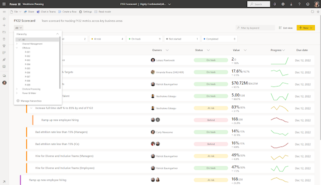
Power BI will cascade connected metric values to each level of the hierarchy. Users can easily drill into the hierarchy to see progress, statuses and do check-ins at different levels. In the images below, you can see the different levels of a project hierarchy in the slicer, and as you navigate to each level or sublevel of the hierarchy, your metric values, statuses, owners, and progress will change along with it.
Scenarios: when to use hierarchies
This is a big feature, and you may be wondering where to get started or how you can use this in your organization. To help you along, we’ve compiled a few useful scenarios where cascading scorecards provide an elegant, large-scale, and most importantly efficient solution. They may help inspire you. If it sounds like you could use this feature, read on for more information.
Scenario 1: Measuring organizational health across teams
Cascading scorecards are great tools for standardized metrics across many different segments in an organization. In this scenario, it’s made it easy to track the health of an organization by measuring employee engagement, satisfaction, and hiring goals – metrics that are often mapped across an entire company. This scorecard below allows senior leadership to see how each division within the organization is measuring against standard metrics like attrition rates, compliance trainings, employee satisfaction, and diverse and inclusive hiring goals.
This scorecard becomes not only an artifact for metric tracking, but an integral tool for decision making at high level of an organization to improve company culture and overall organizational health.
Scenario 2: Retail metrics across locations and product areas
For retail scenarios, it’s often useful to create two hierarchies and use the slicer to view cross sections between them. Here, a retail organization has set up a scorecard that has a geography and a product hierarchy, so they can look at their standard metrics by product, location, or a combination of both. Here they are looking at laptop metrics in Germany. They could even dive deeper and look at specific laptop models in Berlin.
This view is helpful because the owners can be mapped as part of the hierarchy as well, ensuring that each retail locations’ metrics are being owned and managed by the appropriate branch manager.
Check-ins can be performed at any intersection of the hierarchies, ensuring that all integral areas of the business are tracked and updated accordingly. In this case, the same scorecard can be used at every branch location to increase metric performance, driving a data culture at all levels of the company.
Scenario 3: Organizational hierarchies
We often see senior leadership use scorecards driven by organizational hierarchies. There are a set of metrics that the company tracks along an organizational hierarchy – in many cases, compliance metrics. Each person’s team is required to meet these standards, and leadership needs a fast and easy way to see the overall numbers and break them down according to the org hierarchy to see whose team is performing well, and who is behind.
This scorecard uses the organizational hierarchy as the scorecard hierarchy, so that all metrics can be broken down by the accountable person. The heatmap view is also very useful in this scenario as it allows you to get a deeper, side by side glance of whose team is red and whose is green, and identify specific teams that need to increase compliance performance. The heatmap view of organizational scorecards drives alignment and clarity at every level of the business.
Getting started with hierarchies:
Alright, so now that you understand when you might use hierarchies, let’s look at how to get started. There are lot of elements to this experience to cover, so here is a quick summary of what’s to come so you can skip around.
- Setup: how to build your hierarchy
- Viewing: how to use your hierarchy
- Heatmap view: side by side comparisons
- Limitations + vision: where we are, and what’s coming soon
Setup:
As with any big feature, you will need to first do some set up. To access the setup environment, you can choose manage hierarchies from the “all” slicer or select ‘set up a hierarchy’ from the + New menu in edit mode in a premium workspace.
Here, you can start setting up your hierarchy by giving it a name, building the levels of the hierarchy, and mapping them to connected datasets in your scorecard. One example of a common hierarchy we see is a geography hierarchy, with levels like region, state, and city. You will see all the datasets that are connected to a metric back on the scorecard.
From here, you can map your datasets to the corresponding data in each hierarchy level, and you’ll see a preview on the right-hand pane to double check you’re on the right track. You can also map owners in the ‘assign owners’ pivot so that your owners dynamically change with each slice of the data. You can map the owner section for each hierarchy, and it can be connected to any text based column, but best practice is to map it to employee or user data (email, UPN, etc.) to drive accountability.
You can also build multiple hierarchies to see cross sections between slices of data, for example many users will create a geography and product hierarchy to look at revenue metrics for “laptops in Germany” or “smart devices in Seattle, WA.”
Now, you can save your hierarchy and watch as it dynamically changes.
Viewing your hierarchy:
The fun part: let’s use the hierarchy you set up! You can use the dropdown to navigate to whichever level of your hierarchy you want to view. From here you can do things like open the details pane, go to a report, and perform check-ins, just like any other scorecard view.
Heatmap view: side by side comparisons:
Another amazing feature shipping with the hierarchies functionality, is a heatmap view of your hierarchical metrics. By selecting ‘heatmap’ from the view options, you can start to build a custom heatmap view that allows for side by side comparison of whichever slices of data you need to look at. This is an exciting capability as it helps uncover what we call a ‘watermelon problem’, when things look green on the outside, but look red as you take a closer look at what’s going on deeper in the hierarchy. Consumers can even do their own exploration using the pane, showing and comparing different segments.
You can also customize what information to show in each metric box. For example, you can show percent change instead of the current value, and you can turn on and off the status coloring. This is a great view to use in business reviews.
Limitations and what’s to come:
- Notifications will not be triggered for status changes in cases of hierarchical metrics
- There are data limits on hierarchies:
- Up to 10000 items per hierarchy (across all datasets)
- Up to 5 hierarchies
- Up to 5 levels per hierarchy
- Mapped owners apply at the scorecard level, not the metric level
- Roll ups are not yet supported on child scorecards
Linked Metrics
Now, let’s talk about linked metrics. With the release of linked metrics, you now have the ability to show the same metric on multiple scorecards, across multiple workspaces. All check-ins, edits, and updates will be reflected in all the metric locations, making it easier to not create duplicate metrics tracking the same thing. For example, in many organizations, the leadership team has a scorecard, and each department has its own scorecard with metrics from the former along with others that are relevant to the specific department. Using this feature, you can now link such metrics to any number of scorecards and get them to be in sync automatically. Check out a demo of this feature here.
You can link metrics from a scorecard you have build access (i.e., permissions to build content with the data associated with the scorecard), to any scorecards you have edit access. To link a metric, go to edit mode and select “Link to existing metric” from the “New” button.
Pick the scorecard that contains the metric you’d like to link.
Now select the metric(s) you’d like to include in this scorecard.
Once you hit “Continue” the linked metric(s) will appear on the scorecard.
Note that you can add check-ins from the linked metric but you can only make edits in the source metric. You can navigate from the linked metric to the source metric by selecting “Go to source metric” from the overflow menu of the metric.
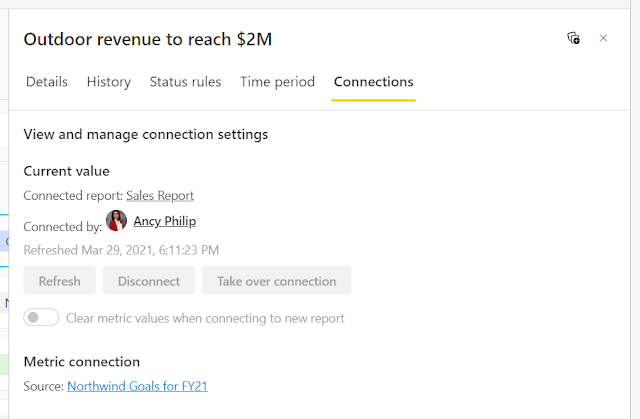
You can see the name and link to the source scorecard in the Details pane and in the Connections pane.
Limitations for linked metrics
- Linked metrics and hierarchies: If you filter your scorecard by a hierarchy, linked metrics will not be filtered but will continue showing their original value. Check-ins to linked metrics are not allowed on a hierarchical child scorecard.


Comments
Post a Comment
Hi User,
Thanks for visiting My Blog and please provide your valuable feedback and subscribe for more updates. Please don't post any spam content or comments.
Thank You