Power BI December 2023 Feature Summary
Welcome to the Power BI December 2023 update. We’ve got a lot of great features this month. Here are some key highlights:
Contents
Reporting
On-object Interaction updates 
New on-object default setup is here!
Each month we’ve been working toward giving users more flexibility in how they prefer to work with the PBI editor. This month we’re introducing a new default setup that feels closer to the previous classic look. With this new default, we’ll help you preset the following options with just one click!
- Move the “build a visual” menu to the pane switcher by default
- Show both build and data panes expanded by default
- Format pane in the pane switcher by default
- “Always open in new pane” set to ON, thereby stacking panes by default
- Collapse panes to the pane switcher instead of close “X” by default

Upon updating to the new December build, with the new on-object preview switch ON, you’ll be greeted with a dialog to update to the new default setup. If you like your existing on-object setup and do not wish to have a more classic look, choose Keep setup and no changes will be made.
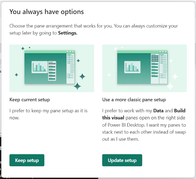
If you change your mind, you can always go back to the Options menu to customize the experience to your needs. Here’s a walkthrough of what each of these options do:
- Suggest a type by default – If you prefer option in the Build menu to be off by default, expanding all the field wells always, make sure this is not checked.
- In the Build a visual menu, always show all the visualization types – If you prefer to see all the visualization types shown by default in the Build menu, be sure to check this option.
- Always show pane switcher – When checked, this provides the right-hand pane switcher shown even when working with zero panes. Provides access to the “+” menu and setting gear always.
- Always show the Build a visual menu in the pane switcher – This moves the build menu from showing next to the visual, to the pane switcher on the right side instead. Check this option if you prefer to work with the Build menu as a pane.
- Always open a new pane – Instead of switching between panes, check this option if you prefer the stacking behavior as before. With this option on, opening a new pane will open side-by-side by default.
To summarize, here’s the state of these settings for the new default setup:

Multi-select in data flyout
To cut down on the extra clicks when first adding data using the new “add data” button, the data flyout now allows you to multi-select fields to add fields in bulk to your visual, just like the data pane! Simply check all the fields you’d like to add to your visual in one go.
This works best when “suggest a type” is ON so you can add as many fields as you like and PBI will place the fields in the appropriate field wells for you.

In-product user education
With the many changes the on-object interaction introduced, it can hard to know where certain features may have moved. This month we’ve added four teaching bubbles to help users along the way.
- Where’s drillthrough and tooltip page set up?
- A teaching bubble will now point to the new location within Format > Page information.
- Where did the analytics pane go?
- Analytics options like error bars, max, min or percentile lines are now consolidated in the Format pane at the bottom. You can set a max, min or other reference line using the new “Reference line” card in the format pane.
- What happened to the right click options for a field like rename or ‘show value as’?
- They are still available at the right click! Simply right click on the field name to see the same options as before.
- How do I bring back my data pane if the pane switcher is gone?
- You shouldn’t run into this as frequently now that we’ve updated the behavior to collapse panes by default instead of closing. But in case you do, you can always re-open a pane from the View tab in the ribbon.

More styling options for column and bar charts
We’re thrilled to announce that this month brings many new formatting enhancements for column and bar charts in Power BI. These additions are designed to improve your data visualization, enabling more impactful analysis and storytelling capabilities.
Key Enhancements:
- Transparency Control: Adjust the fill color transparency to achieve the perfect balance of visibility and design.
- Border Customization: Introduce borders with precision. Choose a distinct color, or match it to the column’s fill, and define both the border’s width and transparency for a polished look.
These features aim to provide you with greater flexibility and creative freedom in presenting your data, ensuring that your insights stand out with clarity and style. Enjoy exploring these new capabilities and crafting compelling narratives with your data in Power BI.


We’ve also updated the Spacing card with an expanded array of options, and to better reflect all these new enhancements, it has been aptly renamed as the Layout card.
Clustered column and bar charts now feature the capability to invert the series order, allowing you to override the default alphabetical sorting and present your data in a sequence that best suits your narrative.


Lastly, the ribbon chart is also getting many of these same settings. You can now control the transparency of the fill color, add, and format borders, and have more control over the spacing and sorting of the series, with the addition of Series explosion, Spacing between categories, Sort by value, and Reverse order.

Extended customization for data labels
Data labels are also getting more options this month! You’ll be able to identify the active field utilized for your data label in the field well. Changing this to a different data field is both swift and straightforward, allowing you to customize it as needed by adjusting font, color, transparency, display units, format, and conditional formatting. You also have a new option to indicate how the data label is displayed if the value is blank.

But that’s not all! You can also add additional metrics through the new Title and Detail cards.
The new Title card feature allows you to show the same fields used in your legend but can now be displayed on your data labels. This provides the flexibility to disable the legend if preferred, and, like the Value card, you can adjust the font style, color, transparency, among other settings. Additionally, you can create a custom Title for your data labels, utilizing alternative data fields as needed.
Lastly, the Detail card unveils another realm of possibilities, enabling the addition of a secondary metric. This feature allows for the selection of any desired field to be introduced as an additional value within your labels. Moreover, you retain access to the full suite of formatting options for this secondary value, ensuring consistency and precision in your visual.

You’ll see these new options in column, bar, line, and ribbon charts.
Azure Maps clustering aggregation support for bubble layer
We are thrilled to introduce a powerful enhancement to the Power BI Azure Maps visual – the clustering aggregation feature for the bubble layer with customizable styling options. This innovative capability not only enables users to dynamically aggregate data within bubble layers based on distinct zoom levels but also empowers you to tailor the visual representation of clustered data.
Users can now effortlessly style their cluster bubbles, choosing from a range of options including bubble colors, font size and more. This level of customization enhances the user experience by allowing them to visually highlight and emphasize specific aspects of the data, creating more impactful and informative geospatial visualizations. With this added flexibility, the Power BI Azure Maps visual is poised to become an even more powerful tool for users seeking dynamic and engaging geospatial analyses.

Alerting on your Power BI reports with Data Activator
In October we announced the public preview of Data Activator. Many Power BI users have been asking for alerting capabilities within reports, and Data Activator is here to help! From the visual context menu or report toolbar you can choose ‘Set alert’. This opens a pane where you can set the measure you want to monitor and the conditions you want to detect:


Data Connectivity
OneLake data hub in Power BI Desktop
Connectivity to Fabric items (Datamarts, Lakehouses, Warehouses, KQL Databases) via the OneLake data hub is now generally available, following the earlier announcement of Fabric’s general availability.

Service
Storytelling in PowerPoint – Suggested Content
This month we’re introducing a new feature for the Power BI add-in for PowerPoint that makes it easier to find and insert the Power BI reports you need for your presentation.
When you add the Power BI add-in to your slide, the add-in automatically scans the title of the slide and suggests Power BI content that might be relevant. For example, if the title of your slide is “Holiday campaign status”, the add-in will show you a list of Power BI reports that contain data about campaigns.
The add-in also shows you reports you’ve recently visited in Power BI, so you can easily access reports you’re working on or frequently use.
Note: If the report you wanted to add doesn’t appear in the list of suggestions, you can just copy the report’s URL and paste it into the input box, as you’ve always done.


And, if you have permission to grant others access to this report, you can also select the “Give people automatic access to this data” checkbox, so that when others in your org view this presentation, they’ll be able to see the data you’ve just added to the slide.
Ability to search and sort in paginated reports
This month, we introduced the ability to search for content across all pages of a paginated report on the PBI service. The paginated report can either be published to the service or can be authored on the PBI service. Specify any required parameters to view the report before searching. The search works across all pages of the report.


Developers
Power BI Custom Visuals Authentication API
This API allows Custom Visuals to obtain Azure Active Directory (AAD) access tokens through single sign-on (SSO), facilitating secure and efficient user-contextual operations. The API will be controlled by a global admin setting.
Dynamic drill control
This feature allows the visual to enable or disable the drill feature dynamically using an API call.
- When the drill feature is enabled, all the functionalities of drilldown and expand/collapse features are available. These functionalities include API calls, context menu commands, header drill buttons, and support for hierarchy data.
- When the drill feature is disabled, these functionalities aren’t available.
Git integration conflict resolution
When working with Git integration in Fabric, conflicts can occur if the same items are edited in both the Fabric workspace and in the connected Git repository. To avoid any mistakes, items in conflict are marked as such, and the conflicts must be resolved before any further changes can be made. In these cases, it is up to you to decide which changes to keep and which to discard.

To make things easier, we’ve added the option to resolve conflicts and select which content to keep directly within the Fabric workspace, so that you don’t have to navigate elsewhere or revert to previous versions.
Accessed by updating items from the source control pane, resolving conflicts is as simple as selecting whether to accept incoming changes or keep the current content for each item in conflict:
Once the selections are made, all items can be merged and updated, and any further changes can be made in the workspace.
Resolving conflicts can also be done by reverting either the workspace or the Git branch to a previous state, or directly in Git if you need to further inspect what changes were made and which version to choose.
Visualizations
New visuals in AppSource
Activity Gauge by Powerviz
The Activity Gauge by Powerviz is an advanced visual used to measure the progress against a set target or goal for multiple categories. It is typically presented in the form of a radial bar chart/gauge, displaying a range of values or percentages. This visual is commonly used for project management, performance tracking, and monitoring Key Performance Indicators (KPIs).
Key Features:
- Gauge Customization: Shape, style, and add icons for a unique design.
- Targets: Choose from options or use a custom field to set a target.
- Data Colors: Offers 7 schemes and 30+ color palettes.
- Center Circle: Customize center circle with text, icons, measures, and images.
- Interactive Mouseover: Hover for Interactive Info Display.
- Conditional Formatting – Create rules based on measure or category rules.
Other features included are ranking, annotation, grid view, show condition, and accessibility support.
Business Use Cases:
- Project Management: Track task progress for efficient management.
- Financial Dashboard: Gain insights into key financial metrics.
- Employee Performance: Evaluate contributions and identify areas for improvement.
Try Activity Gauge for FREE from AppSource
Check out all features of the visual: Demo file
Step-by-step documentation and Feature Video
Follow Powerviz for more updates. Learn more about visuals.
Navigate Financial Risks and Rewards with Profitbase’s Power BI Visualization
Risk is an inherent part of doing business. That doesn’t mean you have to settle for total unpredictability. Profitbase’s new Risk Matrix visualization for Power BI provides businesses with a better way to visualize and assess potential risks. This helps them handle and minimize potential damage, in addition to discovering opportunities that the business can benefit from.
Advantages of the Risk Matrix by Profitbase:
- Efficient Risk Assessment: Quickly evaluate risks by impact and likelihood.
- Focused Prioritization: Spotlight and tackle high-priority risks, focusing your resources effectively.
- Strategic Allocation: Employ our tool to guide wise resource distribution for better efficiency.
- Harmonized Communication: Establish a common understanding among teams and stakeholders with a well-recognized method.
- Flexible Customization: Personalize the matrix size, from 5×5 to 3×3 or 3×5, and colors to align with your company’s branding.
- Dynamic Visualization: Adjustable bubble sizes animate your data, offering a clear financial perspective.
Intuitive multi-level donut charts for your reports
Drill Down Donut PRO for Power BI guarantees the best user experience when it comes to multi-level donut charts. All interactions take place as on-chart interactions, ensuring a quick and easy data exploration experience. Control every aspect of the chart through extensive customization, and even select from multiple chart types (donut, pie, gauge). Get Drill Down Donut PRO now from AppSource.
Main features:
- Adjustable “Others” slice – set the number of visible slices and group the rest.
- On-chart interactions – no need to learn hidden controls.
- Custom tooltips – select ZoomCharts custom tooltip or Power BI built-in tooltip.
- Full customization – customize every slice, label, and legend.
- Desktop and mobile device navigation – explore charts the same way on any device.
Popular use cases:
- Sales and marketing – measuring campaign performance and research results.
- Human resources – staff composition, salary distribution, performance data.
- Accounting and finance – income and expense analysis, billings, creditors, and debtors.
- Project management – risk distribution, resource allocation.
ZoomCharts Drill Down Visuals are known for interactive drilldowns, cross-filtering, and rich customization options. They support interactions, selections, custom and native tooltips, filtering, bookmarks, and context menu.
Inforiver Analytics+ 3.2
Inforiver Analytics+ (50+ Charts + Cards + Tables) by Lumel is now a complete No-Code storytelling visualization platform that is designed to help customers migrate legacy dashboards from Tableau, Spotfire, Qlik, Cognos, SAP Lumira, or their static PowerPoint dashboards from Think-cell or Mekko Graphics and consolidate them with Microsoft Power BI.

Why choose Inforiver Analytics+ as your migration companion to Power BI:
- Small Multiple & Trellis everything like Tableau and Spotfire
- “Visual PivotTable” for your Hierarchical data on all three axes (x,y,z) like Spotfire.
- Split and Group Measures into Trellis panels like Tableau
- Storytelling features like Think-cell and Mekko Graphics
- Dynamic Deviations (CAGR),
- Annotations,
- Series connector lines,
- Automatic series and categorical sorting.
- Trellis Tables with Excel-like formatting
- Advanced visualizations:
- Box and Whisker Plot – dynamic and pre-calculated quartiles
- Marimekko Chart (Variable Width column or Cascade chart) – stacking and 100% scales
- Advanced Waterfall- Measure-based Interim, Stacked & Dual Breakdown, Variance, and Combination
- Special Charts for Story Telling:
- Slope graph,
- Lollipop and dumbbell,
- Dot Plot,
- Arrow & range Plots
The Microsoft Purview hub in Fabricfor creators
The Microsoft Purview hub is a centralized page in Fabric that helps Fabric administrators and users gain insights about their Fabric data estate. It contains reports that provide insights into sensitive data and item endorsement and serves as a gateway to more advanced capabilities in Microsoft Purview. Following the public preview release of the Microsoft Purview hub for Fabric tenant admins in May, the hub is now available in public preview for all Fabric users.

VideoPlayer Visual
We are excited to introduce the VideoPlayer visual for Power BI Desktop! This new custom visual allows you to seamlessly integrate videos into your Power BI reports, enhancing your data storytelling capabilities. With VideoPlayer, you can enrich your reports with dynamic multimedia content to engage your audience effectively.
Key Features
- Video Integration: Easily embed videos from various sources, such as YouTube, Vimeo (including password protected videos), and many others, directly into your Power BI reports.
- Interactive Playback: Control video playback using intuitive play, pause, and seeking functionality, ensuring your audience can interact with the content as needed.
- Customization: Customize the appearance of the VideoPlayer to match your report’s style and design, including changing the video player’s dimensions and controls.
- Data-Driven Video Selection: Utilize data-driven techniques to determine which video to play based on your dataset, making your reports more insightful.

Ridgeline Plot by Powerviz
A Ridgeline Plot or Joy plot is an advanced Power BI visual, that visually represents numeric variable distributions across multiple categories on a continuous axis. The overlapping mountain ranges allow easy comparison. Ridgeline Plot effectively highlights patterns of distribution change across different categories, providing insights into the variability and trends within the data.
Key Features:
- Multiple Distribution: Ability to plot more than one value in Measures.
- Ridge Style: Different lines, and marker styles available.
- Scaling: Control Y-axis scaling and overlaps.
- Colors: Apply color schemes across X-axis, Y-axis and based on FX rules.
- Ranking: Filter Top/Bottom N values, with “Others”.
- Reference Line: Highlight ranges or important data points on X and Y axis.
- Mode Line: Emphasize peak points and display labels.
- Custom Tooltip: Add highest, lowest, mean, and median points without any DAX.
- Themes: Save designs and share seamlessly with JSON files.
Other features included are ranking, annotation, grid view, show condition, and accessibility support.
Business Use Cases:
Time Series Data, Statistical Analysis, Distribution Data


Comments
Post a Comment
Hi User,
Thanks for visiting My Blog and please provide your valuable feedback and subscribe for more updates. Please don't post any spam content or comments.
Thank You