Power BI Report Server January 2024 Feature Summary
We have made it easier for report consumers with visual impairments to get tabular data for all visuals on a page with one selection, displaying the data in the way that best meets their particular needs with show visuals as tables, an added menu item. We promised you better looking reports, we are now delivering extended data labels, and more styling options, which improves aesthetics for column and bar charts, an added benefit for neurodivergent individuals with cognitive disabilities.
Contents
Reporting
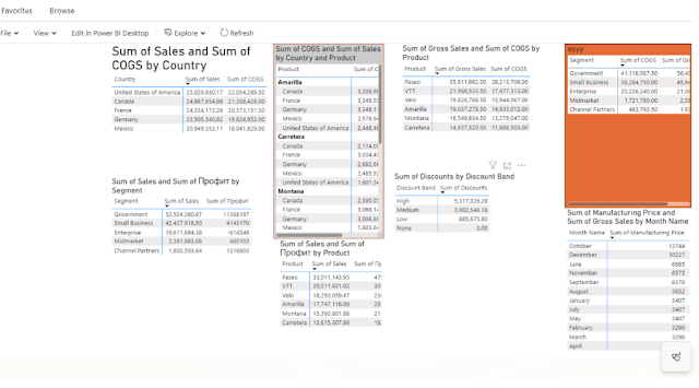
Show visuals as tables
Leveraging our previous accessibility improvements to table and matrix, we are now introducing a new view mode called Show visuals as tables which displays report visuals in a tabular format with a single action. Some users may prefer to consume data in a text-based or tabular format depending on their different learning styles and usage of assistive technologies. This provides a supplemental format for visuals that allows users to display the data in the way that best meets their needs.
This new view mode is similar to how Show as a table displays underlying data for individual visuals today. Show visuals as tables will display the underlying data for visuals for all pages in the current report, with the added functionality of interaction and cross-filtering capabilities.
To activate this view mode, navigate to the view dropdown menu and select Show visuals as tables.

More styling options for column and bar charts
We’re thrilled to announce that this month brings many new formatting enhancements for column and bar charts in Power BI. These additions are designed to improve your data visualization, enabling more impactful analysis and storytelling capabilities. Here’s a quick look at the new features available now!

Key Enhancements:
- Apply Settings to All or Series: Enjoy the versatility of applying formatting options globally across all categories or tailor them for each unique individual series, effortlessly and efficiently!
- Transparency Control: You can now adjust the fill color transparency to achieve the perfect balance of visibility and design.
- Border Customization: Gaining superior control, you can now introduce borders with unmatched precision, choosing a distinct color, or match it to the column’s fill, and define both the border’s width and transparency for a polished look.
- Layout: We’ve renamed the Spacing card to be the new Layout card, relocated the familiar Reverse Order toggle that allows you to invert series, and introduced Sort by Value, Space between categories, and Space between series. And, with clustered columns and bar charts, you now have the option to Erode or Explode the stacked series.
- Advanced ribbon settings: Highlight a series or create visual continuity with an array of options including matching series color or choosing a color selection, transparency, border color matching or color selection, border width, and border spacing.
If you’re looking to learn more comprehensive information about these new features we’ve rolled out for column and bar charts, look for our dedicated blog post.
Extended customization for data labels
Data labels are also getting more options this month! With this month’s update, you’ll discover some new enhanced capabilities for Data labels, giving you extended customization choices to seamlessly match your reporting needs, and it brings the simple integration of additional metrics, dramatically improving your data analysis experience. Here are this month’s highlights!

Key Enhancements:
- Title: The new Title card feature enables the display of legend fields on your data labels, offering the option to omit the legend for a cleaner look. It also allows customized data label titles using different data fields, adjustable font style, color, and transparency.
- Value: Easily spot the active field for your data label in the field well. Modifying it to another field is quick and easy, with customization options like font, color, transparency, and more, plus a new feature for blank value display.
- Detail: Our new Detail card feature unlocks new potential by allowing the inclusion of a secondary metric to your data labels. Choose any field to add an extra value, with the full range of formatting options at your disposal.
- Visual label layout: A new feature that lets you choose between a sleek single-line data label or a multi-line data label, where desired.
We invite you to explore these remarkable new features of Data labels to significantly enhance the data density in your charts. Available for Columns, Bars, Lines, and Ribbon charts, these advancements are ready to transform your reporting. We’re excited to hear your thoughts on these innovations and value your input on future Data Label enhancements!
Comments
Post a Comment
Hi User,
Thanks for visiting My Blog and please provide your valuable feedback and subscribe for more updates. Please don't post any spam content or comments.
Thank You